Color Theory Basics: How to Choose a Palette That Works
Picking colors shouldn’t feel like guesswork. Understanding color theory basics helps you build palettes that feel balanced, intentional, and professional, whether you’re designing a website, a logo, or a room. In this guide, you’ll learn the core principles behind color choice and how to apply them confidently.
What Is Color Theory
Color theory is the study of how colors interact, combine, and affect emotion. It’s the foundation behind every strong visual design.
Learning color theory basics gives you a framework instead of relying on random trial and error.
Why Color Choice Matters
Colors influence mood, trust, and even buying decisions. The right palette can make your brand feel calm, energetic, or luxurious instantly.
The Color Wheel Explained
The color wheel organizes colors by their relationships. It’s the starting point for every palette decision.
Primary, Secondary, and Tertiary Colors
- Primary colors: red, blue, yellow
- Secondary colors: green, orange, purple
- Tertiary colors: mixes like red-orange or blue-green
Understanding these groups makes it easier to predict how colors will blend.

Popular Color Harmony Types
Once you understand the wheel, harmony rules help you combine colors that naturally work together.
Complementary, Analogous, and Triadic Palettes
| Harmony Type | Description | Best For |
| Complementary | Opposite colors on the wheel | Bold contrast |
| Analogous | Colors next to each other | Calm, cohesive looks |
| Triadic | Three evenly spaced colors | Vibrant, playful designs |
These combinations remove guesswork from choosing a color palette.
Color choices are just one piece of the puzzle. If you want to see how these skills come together in real projects, check out our post on What Makes a Good Graphic Designer vs an Average One? to understand the traits that separate great design work from average results.
Whether you’re a beginner designer or a small business owner picking brand colors, the good news is that color theory basics are easier to learn than they seem. You don’t need fancy software or years of design experience, just a simple understanding of how colors relate to each other. Once you grasp these core principles, choosing a palette becomes a quick, confident decision instead of a stressful guessing game.
How to Choose a Palette That Works
Selecting the right palette isn’t just about aesthetics. It’s about purpose, audience, and consistency.
Steps to Build Your Palette
- Choose one dominant color that reflects your brand or mood
- Add one or two supporting colors using a harmony rule
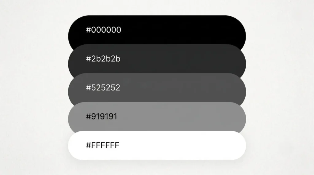
- Include a neutral (white, black, or gray) for balance
- Test the palette across different backgrounds
- Limit your palette to 3–5 core colors
Applying color theory basics at each step keeps your design consistent and intentional.
Benefits, Tips, and Common Mistakes
A strong palette saves time and boosts visual appeal. Here’s what to keep in mind.
- Stick to a consistent color ratio (60-30-10 rule)
- Test colors in both light and dark environments
- Avoid using more than five main colors
- Check contrast for accessibility
- Save your palette with hex codes for consistency
Avoiding these common mistakes keeps your palette functional, not just pretty.
FAQ
What are the basics of color theory?
Color theory basics include understanding the color wheel, primary and secondary colors, and how combinations create harmony or contrast.
How many colors should a palette have?
Most effective palettes use three to five colors, including one dominant shade, one or two accents, and a neutral tone.
What is the easiest color harmony for beginners?
Analogous color schemes are beginner-friendly since they use neighboring colors on the wheel, creating a naturally cohesive look.
Can I mix warm and cool colors in one palette?
Yes, but balance is key. Use one temperature as the dominant tone and the other as an accent for visual interest.
How do I test if my color palette works?
View it across different backgrounds, screens, and lighting conditions, and check contrast ratios for readability and accessibility.
Conclusion
Mastering color theory basics doesn’t require an art degree, just a clear framework and a bit of practice. Start with the color wheel, choose a harmony type, and build a palette with purpose. Ready to put these color theory basics into action? Start sketching your palette today.
Follow Us On — Instagram | Facebook | LinkedIn | Pinterest | Youtube